
I analysed 22 Architect websites operating in Birmingham, England, specifically looking at their technical performance, their homepage, and their portfolio and blog systems where relevant. The purpose was to illuminate general trends and priorities for web development in service to Architects, and perhaps offer a deeper understanding of how their sites work and why.
General Observations about Birmingham Architect Websites:
In my analysis of 22 local websites, I found that:
- 1 website completely failed to load.
- 1 website was not a real architect website, but a profile the firm had on another platform, analogous to having a Facebook page instead of a website.
- 1 website was currently under construction (pun not intended).
Each of these has been excluded from further analysis since two cannot be viewed and one isn’t a real website. The working total from now on is 19 architect websites in Birmingham. Of these:
- 5 (19%) are using video headers.
- 9 (47%) have cookie banners/pop-ups that probably aren’t needed. 3 (16%) are “invasive” (i.e they take control off the visitor and force you to engage before you can use the website) and 1 (5%) has no “deny” option, requiring manual de-selection in a separate screen, falling below the standard of what I consider to be privacy-friendly, into privacy-hostile.
- 2 (11%) use Google Recaptcha, a non-privacy-respecting recaptcha method, with no way to opt-out as a visitor.
- 14 (74%) feature prominent images in the hero section.
- 16 (84%) feature some kind of portfolio.
- 15 (79%) feature some kind of blog, or system meant to work like one (news, updates, journals).
- 11 (58%) have an unclear CTA (Call to Action), or no CTA at all.
Noticed Pain Points for Architect Websites:
- Several sites have centre-algined text right under hero that serves as an “about” section but often drifts into a “services” section too. This seems to be a section architects struggle with, feeling it a necessary part of their site but not implementing it well.
- About half of the sites had sub-par navigation, largely owing to a poor use of headers. Footers were under-utilised as well, though.
- Many sites perform poorly in PageSpeed Insights on mobile, likely due to heavy and un-optimised image and video content. This could be mitigated somewhat by better compression/resizing, but also possibly by better hosting, or caching, too.
- The overwhelming majority of sites had some kind of portfolio system, and many of them also had blogs. These seem to be two critical features for Architect websites, but despite seemingly knowing this, many struggle with implementation. More on this later.
- Architects, unsurprisingly, like very visual website designs – in this they have a parallel with photographers, where the content is image heavy.
- 9 of 19 (67%) are using WordPress, with 1 using Squarespace, and the rest unknown. This comes with implications for sovereignty and ownership over site content.
Methodology & Disclaimer:
Methodology and Disclaimer
My intention was to focus on industry trends rather than individual businesses, so I have anonymised practices where I discuss shortcomings because I do not want to shame or belittle people just trying their best to get along in life. Where I highlight particularly good examples, I name them so readers can examine the approach themselves. In large datasets, all names are anonymised.
Honesty & Transparency:
Where a website has been selected as a winner in a category, it has been independently chosen by me based on the reasoning I outline below. No firm can pay or sponsor me in order to appear here, nor will this ever be a possibility. Firms are also not asked before-the-fact as a matter of course, to prevent any influence. I do contact them after publication to let them know they have been featured.
Statistics:
Where percentages are given, they are rounded to the nearest whole number for easier legibility.
Testing Environment:
Desktop: Ungoogled Chromium (on Linux, Fedora 44)
Mobile: Google Chrome on Android
Typically I use Firefox with privacy plugins and tweaks, but this broke several websites included in the audit. Some commentary may therefore be made about the lack of privacy-respecting architecture behind those sites, but for a more realistic simulation of the ‘average’ user (who doesn’t tinker with their browser for privacy gains), I used an unmodified chromium browser.
Chrome and Chromium are not the same, but they are running on the same engine. Chrome itself is the most popular browser on the internet, reflecting the experience of about 70% of web traffic (as of writing – this site is a live counter so if you’re reading this in 2030 it’ll be different – hopefully less!).
Search Terms & Why These 22 Sites?
The websites in this audit are the first 22 collected from the search “[B]irmingham architects” and “architects in [B]irmingham”. Many were pulled from the Google Businesses listings before the search results, though several were pulled from the search results too, reflecting how most people interact with the search engine.
While there are more firms than this, I chose the ones that came up first (removing duplicates) – mostly on the first page or in the Businesses section – because as an Architect firm yourself, these set the standard of your competition. Analysing sites ranking on page 12 is therefore of little use to you – you want to be ranking higher than that, and clients aren’t looking that far down Google’s search results.
First Impressions:
Architect websites in Birmingham would largely benefit from improvement. Many of the websites are trying to accomplish a similar thing: that is, a statement image, some ‘about’ text anchoring the reader in the prestige of the firm, and then a portfolio.
Several sites, though, were hurt by bad UX (web designer shorthand for User eXperience). Notable issues included:
- 7 (37%) websites with cookie banner popups that probably aren’t necessary,
- 9 (47%) websites (7, + 2 others) with privacy-unfriendly data collection/analytics,
- 2 (11%) with broken headers, and
- 8 (42%) with no clear CTA (Call to Action) before the fold (that is the part of the site you see before scrolling).
1 website was clearly AI generated. More on that later.
In their favour, nearly all websites (16) have some kind of portfolio, correctly identifying this as a vital part of an architect’s online presence. Many also had a blog or something intended to play that role, coming in at 15. For many, this was called a “Journal”; for several others it was a “News” feed; and a couple had both. They serve slightly different purposes.
Several sites also had both a Blog and a Portfolio. This is excellent, rich content that helps built topical authority on the subject of architecture, and gives useful signals to Human and Google about things like your service area (portfolios) and expertise (blog), making your site more credible and more trustworthy.
Technical Data – PageSpeed Insights Scores:
I’ll start with laying out the statistics and draw inferences and conclusions from them after. I’ve included the other PageSpeed categories for completeness, but I haven’t analysed or ranked them here because they aren’t the focus of this study. We’re just looking at performance, homepages, and portfolio/blog systems.
Mobile Scores:
| Company | Performance | Accessibility | Best Practices | SEO |
|---|---|---|---|---|
| Alpha | 49 | 91 | 96 | 92 |
| Bravo | 34 | 96 | 96 | 92 |
| Charlie | 38 | 67 | 77 | 85 |
| Delta | 86 | 96 | 100 | 100 |
| Echo | 61 | 98 | 100 | 100 |
| Foxtrot | 85 | 72 | 96 | 75 |
| Gold | 45 | 88 | 92 | 100 |
| Hotel | 83 | 97 | 100 | 100 |
| India | 55 | 93 | 96 | 92 |
| Juliet | 73 | 92 | 58 | 100 |
| Kilo | 36 | 93 | 96 | 100 |
| Lima | 54 | 85 | 96 | 92 |
| Mike | 66 | 82 | 92 | 100 |
| November | 54 | 96 | 100 | 92 |
| Oscar | 55 | 94 | 100 | 100 |
| Papa | 32 | 88 | 73 | 92 |
| Quebec | 74 | 85 | 100 | 100 |
| Romeo | 51 | 100 | 54 | 92 |
| Sierra | 84 | 97 | 96 | 92 |
Desktop Experience:
| Architect | Performance | Accessibility | Best Practices | SEO |
|---|---|---|---|---|
| Alpha | 94 | 90 | 96 | 92 |
| Bravo | 71 | 93 | 96 | 92 |
| Charlie | 72 | 76 | 77 | 85 |
| Delta | 99 | 96 | 100 | 100 |
| Echo | 87 | 95 | 100 | 100 |
| Foxtrot | 75 | 77 | 96 | 75 |
| Golf | 73 | 83 | 92 | 92 |
| Hotel | 100 | 97 | 100 | 100 |
| India | 82 | 93 | 96 | 92 |
| Juliet | 95 | 98 | 58 | 100 |
| Kilo | 73 | 94 | 58 | 100 |
| Lima | 79 | 85 | 96 | 92 |
| Mike | 87 | 82 | 96 | 100 |
| November | 64 | 96 | 96 | 92 |
| Oscar | 65 | 94 | 100 | 100 |
| Papa | 46 | 84 | 77 | 92 |
| Quebec | 99 | 85 | 100 | 100 |
| Romeo | 85 | 100 | 54 | 92 |
| Sierra | 95 | 97 | 96 | 92 |
Thoughts on Birmingham Architect’s Website Performance
Overall, site performance across the board was not exactly outstanding. Performance matters because it tests a simulated ‘average’ scenario; that is, a device with a stable connection and about average power. Of course in reality, about 50-60% of web traffic is now from mobiles, which are often weaker than computers and may be connecting from a less stable connection – for example on the train going between Four Oaks and Shenstone, where I never had good signal when I used to commute that way to a Birmingham college.
A slow site will perform poorly in these conditions and this can cost real leads.
The statistics below reveal several trends about Architect websites in Birmingham:
- Mobile performance ranges from 32 (lowest) – 86 (highest), for an average of ~58. This leaves room for improvement.
- Only 4 sites got a score at 80+. Not one managed 90, which is what Google considers “good”.
- On desktop, scores were better – as is expected, with the curious exception of Foxtrot Architects, whose desktop scores were lower. The range was between 46 (lowest, 14 points higher than the Mobile low) and 100 (highest, also 14 points higher than the Mobile High).
- 10 sites score above 90, which is excellent.
- Only 2 sites score below 70.
Therefore, mobile performance is significantly worse across the board than desktop performance. This is common, and often caused by a mix of unoptimised images, bloat in the page (such as excess code or not lazy-loading later content), poor or absent CDN/caching setup, or perhaps even poor-quality hosting. Many sites could dramatically improve performance by addressing this, which would improve user experience and retention.
The State of Homepages on Birmingham Architect Websites:
The Hero Section
Key Finding:
Architect websites heavily favour statement pictures or videos in the Hero, but struggle to reconcile this with clear CTAs (see below) or good technical performance (see above).
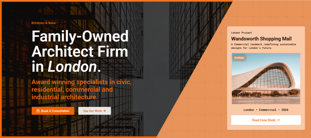
Not surprisingly, the overwhelming majority of architect websites audited in Birmingham feature bold images (or video) immediately as the page loads, in what designers call the Hero section. 15 of 19 (79%) took this approach, where 3 (16%) were videos, 12 (63%) were images, and of those 12 images, 4 (33%) were carousels – several images that rotate around on a reel.
Two things stand out about Architect website hero sections.
- They’re media-heavy.
- They’re nearly always meant to be a statement piece, and architects know (and probably desire) this.
Only two sites didn’t do this, and they are not, in my view, better for that omission. Architecture is, to clients especially, a very visual industry. It is important to lean into that; like web designers and like artists, there are of course deep systems that support your work but the client’s interest isn’t piqued by technicality – they shop at first with their eyes.
Calls to Action (CTA)
Key Finding:
Calls to action are missing or unclear from 10 (52%) of the reviewed websites. This is a massive portion of the sample size wasting the most important space on the page.
CTAs are powerful when done right, because they lead the visitor of your site on a journey that you control. Ultimately, a site is meant to get the visitor to do something. For an architect, that may be to contact you, versus for example a coach where it may be to book into an online calendar.
52% of the Architect websites in Birmingham had no call to action, or an unclear one in the Hero section. In most cases, this correlated to a design choice: to display a large statement image or video in the hero. My assumption then is that whoever designed the website didn’t want to ruin the statement image, and/or didn’t know how to have both the statement and a CTA. This isn’t optimal for lead generation, and it’s a common mistake. Around 70% of small business websites don’t have CTAs.
The problem with this is that it hurts conversions. 48% of websites did still have a CTA, despite also having a statement image in many cases, improving their chances at higher engagement rate from vsitors.
Of the 10 of Birmingham Architects with no CTA, only 1 then followed up with an action in the next section which was below the fold (e.g. you had to scroll. Most of the others went straight into an About section, where there was also nothing to interact with. A few went into a portfolio, which is better, but still not very effective if the portfolio posts themselves don’t end with a CTA.
Notes on CTAs
There are moments at which it is beneficial to both the client and the business to insert buttons for the visitor to use. These should be placed in locations where a decision is likely to be made. The Hero is obvious as a guest lands with fairly high intent but not much direction at this stage. Clever design, then, will use the Hero for its intended purpose: orientation.
But CTAs should also be placed at the end of portfolios (more on those later), after a ‘values’ section, and perhaps after an ‘About’ section – depending on how it is written. Services, if there is a section for that, would also need a CTA, but it’s quite common now to see these turned into cards rather than paragraphs with a button underneath, so the card itself becomes both the content and CTA. There’s one example of harmonising UX and design, allowing a more bespoke and professional look for your site while keeping navigability high.
Pritpal Chana – The Best Hero Section & Why:

Pritpal Chana have what I consider to be the best hero section of all the sites audited for a few key reasons.
- The header navigation is clear and intuitive, and has good contrast with most of the background images that cycle behind.
- The firm’s branding is prominent but not obtrusive – so you get a feel that it’s Pritpal Chana and not “an architect”.
- The main heading is good for SEO, it matches the sort of thing people actually search for, as opposed to something generic like “the home of your dreams”.
- The subheading offers clarity and specificity quickly. Both work together to do what a Hero should: orient the visitor.
- There is an immediate and clear call to action (book a consultation), maximising the chances of generating a lead. There’s also one action, not two, reducing friction for the visitor.
Just following these five steps alone will lead to a much more impactful landing experience for people browsing your websites. Notice as well that Pritpal Chana was able to balance two interests that compete on a lot of other architect sites: they have both a statement image and a clear CTA.
The About Sections on Architect Websites:
Key Finding:
These are a unique part of Architect websites that seem to be highly valued. They’re often quite charming, but they’re also often slightly confused about what exactly they’re trying to be: “Services”, or “About”?
Most architect websites I’ve seen – and this transcends Birmingham – follow a statement image/video with an About section. This is noteworthy because other local services don’t – from the gardener or bricklayer to the accountant or law firm, most follow up with Services first, answering “what do I do?” before “who am I?”
This suggests what my experience confirms: there is a sense of pride with Architects that’s a bit different. It’s the streak of the artist in you, I think. Shakespeare was a writer but we don’t just associate him with words, we associate him with Stratford too.
It means something to you to be of a place. Especially, I imagine, one you very literally helped to build.
I don’t at all mind this. I think a lot of typical SEO/copy-minded people would say you should answer the “what” before the “who” but establishing a rapport is no bad thing. Indeed I like it and find it quite endearing.
14/19 (74%) of you do this. Common things these sections say are:
- Award-winning
- RIBA Chartered Practice
- Architects Registration Board
- Your location
- Your experience
They can also sometimes be a bit guilty of keyword stuffing and sounding sales pitch-y. I’ve seen several that talk about the services you offer too, but this is confusing the role of this section: either it is an “about” or “services” but it shouldn’t be both. This saps it of rapport as an “about” because it feels like a pitch, and it saps it of utility as a “services” because it feels like a CV.
This is a delicate section that is often poorly designed – 8 of the 14 (57%) Birmingham Architects that had one of these sections formatted them as simply a heading and block of text centre-aligned, with no design flair at all. Clearly, this is something Architects want on their site but really struggle to convey well.
Of the sites that didn’t have this about section, two had nothing at all: one site had no scroll, that was it – and the other site showed only a contact form (that was too long) before the site ended. Both of these are poor decisions from both a rapport and UX standpoint.
Best About Section & Why: The General Architecture Company Ltd.

The best About section was a more challenging call. As mentioned before, this centred design is very common on architect websites – but The General Architecture Company elevated it with more personality than others managed. The font and colour here make both more interesting and more memorable, and in content it stood out too for being more human and personable. I felt more warmth reading theirs, and if I was looking for an architect this would make me want to reach out to them more.
It also does a good job of keeping to its role as an “About” section, not slipping too heavily into feeling like reading about services on a trade site. This is classy and reassuring and for those reasons was my favourite.
Website Headers & Navigation:
Key Finding:
Most websites have some small mistakes with the heading that make navigation just a little more awkward that it has to be. The structures themselves were fine, and often logical, but design choices like not having the header anchor to the page create a small but noticeable distance between “perfect” and “good enough”.
Most of the Birmingham architect websites I reviewed used sensible navigational structures and had intuitive headers, sorting their services, portfolios, contact options, locations (if relevant) and other information logically. About half committed one of the 5 Common Mistakes People Make With Website Headers, one committing the worst of all: putting the header menu behind a burger menu icon on desktop.
About half of the websites also did not anchor their header to the top of the screen, nor did it re-enter the view when slightly scrolling back up, meaning to navigate the site one is required to scroll all the way back to the top of the page. This is a UX/UI problem, especially on sites (as some of these were) with many pages.
All of those sites would be well-served to follow the standard when it comes to headers: anchored to the top of the screen at all times, ensuring the best navigation and UX for site vistors. Headers are one of those areas where trying to do something different is often harmful: the standard exists for a reason. There’s no need to re-invent the wheel here.
The Best Navigation & Why – Arctek:
This was a hard one to call. A few sites had very similar navigation structures but slight differences in how they felt (which can’t be conveyed in a screenshot) edged them out. Just to give a few examples of the sort of things I mean…
Dropdown Hover vs. Click:
Dropdowns were common, but some activated on hover while others made me click. Hover is preferred by me. It feels more responsive and natural. It also improves the life expectancy of my mouse.
Hovering also creates a clearer distinction between two different ways to engage with a site. I click to act decisively, e.g. contact buttons or bookings, or purchases. I hover to browse, as in a way I’m literally ‘hovering’ on the decision.
Dropdowns: Locations & Services:
Dropdowns were used for “Locations” and for “Services”, but as a client visiting an architect’s website I think services are more important than locations. The reason is that the search term, “Birmingham architect”, took care of the location. It’s not very useful to me to know you also operate in London and Manchester because I’m not there, and as a visitor I don’t want to browse your location pages. You put those up silently in the background as landing areas for people in the target locations, but people on your site don’t need to see them.
Services, I want to know about. That’s what I’d be hiring your for.
Number of Menu Items:
It’s a rule borrowed from photography that odd numbers look better than even, and from web design that a header menu shouldn’t usually have more than 5 items. Each is a choice, and more choices are experienced as friction by visitors. Too many also ruins the design, it looks messy.
Arctek:
With all that in mind, my favourite header/navigation example of the audited Birmingham architects is Arctek. It’s clean and responsive, and obvious to use. Navigation is the one system where you don’t want to introduce novelty or guesswork in my opinion – Arctek have the right approach.

The AI Architect Website:
While I’m not going to do a full audit on this specific site unpaid, (and nor do I wish to single it out), I said at the start I would address the AI site and I do wish to just highlight a few considerations for you as an architect if you’re thinking of getting AI to do your site too.
My honest opinion is that you shouldn’t, and my advice is definitely don’t. I recently had another architect approach me about a project involving AI, which I foresaw having many of these same problems. To name a few:
- No favicon. The little icon you see in the browser tab is called a favicon. Any experienced web designer will tell you that a site that doesn’t have one is signalling something: thoughtlessness. The resulting site usually confirms that suspicion.
- AI text. AI writes predictably, in a way that uses many words to say little, and in a cadence that is easily identified: following the ‘rule of three’ and what I call the ‘pointless contrast’. “It’s not X, it’s Y” and “The build creates a sense of calm, serenity, and peace.” This site does this repeatedly, frequently, and often (you’re welcome).
- Lack of SEO awareness. On a portfolio page for “Fisherman’s Cottage, Devon”, the heading should say something like “About the Fisherman’s Cottage, Devon” and not “The Project in Detail”. The former is a signal to Google that helps it understand the page’s relevance and surface it. The latter is AI failing to do the same.
- Lack of strategy in design. On the portfolio pages we have two CTAs (calls to action) given as whole sections, consecutively, asking the same thing: have you got a project? The first has a button taking you to a locations page, while the second takes you to a “get an estimate” page. This is not only bad design from a UX perspective, but it is going to harm the website too. The correct course – to get an estimate – will less-often be taken because the wrong course appears first.
- Information overload. More writing by far than the average visitor will ever read. The design is just laying out loads of information beautifully, but it’s not thinking about the user’s journey.
- Thin content. It’s an old SEO trick, if you serve several local areas, to virtually copy and paste info from one location page to another. This is not advised now, as it can look like ‘stuffing’ the site with thin content to game SEO systems, something Google is reportedly trying to combat – meaning it may actually hurt your ranking potential.
- This site repeats a lot of the same text in these places, and even the same posts and case studies too. This, I think, is likely because the system behind the website isn’t mature enough to show only Walsall content in Walsall, and only Four Oaks content in Four Oaks, etc. If I’m right about that, it would again typify a shortfall of not having a professional think about the system before putting a LLM to the task of making it.
This AI site has missed the mark for either target audience: it is not for other architects and yet it is they who would be most likely to want to read it. As such it is not commercially very useful website copy for clients.
It is also focused a lot more on writing than it is on design; as an architect, your work does more selling than your words and should therefore take priority. I’ll break down an example below of a site that mastered this.
The designer can spot AI a mile off, but as yet it sometimes evades the ones using it just how obvious it really is.
It doesn’t understand your world as well as you probably think it does.
It’s worth knowing that in advance of using it.
Architect Website Portfolios:
Key Finding:
Most architect websites have a portfolio, rightly identifying that that is both a necessary and stand-out feature of this industry. There are varying ways they have been implemented but the best ones speak less and show more. These should lean more into imagery than text ideally, and should not (though some do) write sales copy into the portfolio itself.
The overwhelming majority of Birmingham architects have portfolios on their website – 16 out of 19 (84%). This is because you all know how much of your work is really a visual endeavour. In this way you’re akin to artists and web designers – you have systems and expertise but what you really sell are results.
A portfolio is a powerful, and often necessary part of work like this. You get to show the visual work but also explain the thinking and processes that helped to create it, positioning yourself as a credible expert on the subject. This has two benefits:
- It is massively re-assuring to clients, if done well.
- It is deep, rich content for Google, which can help with SEO too, as some posts may rank for their own name or adjacent subjects.
Sites Without A Portfolio:
The 3 websites that haven’t implemented a portfolio are missing out, and likely to be easier to out-compete as a result.
One of the downsides to this is, as mentioned, the potential for developing leads off your work. The second, though, is that an architect’s website without a portfolio often feels like a trade site. If your emphasis isn’t on your work, the site is built around only your services and location, and this changes the design decisions that are made around it. The advantage of this approach to you is that your website is cheaper to build, and the disadvantage is that it caps your earning potential. These websites often don’t feel the same, and that comes in a way that risks damaging the perceived value of the work you actually do.
The Best Portfolio and Why: Corstorphine & Wright

Corstorphine & Wright in my estimation have the best portfolio of all reviewed sites. Let’s just do a quick run-down of why, using their Deansgate South project, section-by-section.
- Heading is immediately orienting: it tells me and Google what and where.
- Full-size video of project, half of which is below the fold. I see something visually impressive but I can’t see all of it, so I scroll – and now they’ve got me.
- Quick info summary under: client, location (again, for SEO), sector (which are really just tags, aiding categorisation and SEO), and value (piques human interest).
- A large, natural-language summary of the context in which Deansgate was built, answering the WHY (need for high-quality student residences)
- More gallery, viisually impressive.
- Information in digestible snippets, interspersed between more gallery shots.
- The human faces of the team behind the project is a massive trust builder, and also (if you run a company) rewards the excellence of your team by featuring them.
- Two more portfolio projects you could look at.
- A call to action – get in touch to start your project.
- Trust signals/logos.
- Footer, well-organised for navigation.
Corstorphine are a large company with a bigger budget, for sure, but the skeleton of their website is not new and nor is it black magic. It’s not hard to replicate either, but it is a master-class in simple but effective design and it’s a structure that serves Architect portfolios exceptionally well.
Notice as well how little they actually write? Their portfolio screams immense competence and prowess, and yet it never sells or lectures at me once.
Smaller firms have a tendency to over-justify themselves in their copy, going in for a bit of a hard-sell – often, I’m sure, due to feeling like they need to prove themselves. But it can look insecure.
I’ve seen lines (anonymised) like “Getting planning permission in Sutton Coldfield will require permission from the council, and our experienced planners have the knowledge and expertise to help get your application granted without the stress” written inside portfolio projects. This is trying a bit too hard to hit the SEO notes (planning permission, Sutton Coldfield) and also to sell to you, really getting the balance wrong on both counts.
Corstorphine just told me there were a load of students, they needed accommodation, we built some, and it got an award. Interested? Get in touch. All in a layout that is simple, yet classy.
Less is more.
Conclusion:
Overall, architect firms in Birmingham broadly know what their sites are about, and are striving for the right things: a statement visual design and portfolios to showcase work and build expertise.
There are some web design challenges many of them are yet to overcome that suggest more strategy could have gone into the websites themselves to make their execution all that much stronger.
Some common problems, to give some direction, could be summed up as:
- Slow performance, particularly on mobile.
- Portfolios that are under-developed or slightly misused.
- Slightly awkward navigation.
- Unnecessary privacy compromises at the site architecture level.
- Content that sometimes doesn’t know its purpose, speaking to the wrong audience.
- Weak use of calls to action, making engagement with the site harder than needed.
The understanding of what makes a good site is, in most cases, very clearly there though, and so it is not understanding that architects fall short on. They know their domain very well: it’s just a case of tidying the execution where it comes to presenting that on a website.
They are by no means disastrous as a collective, and a lot of the larger decisions are taken nearly unanimously. A bit more care over the more minor, less apparent aspects of web design like navigation – which only really show up during use – and technical performance, would see noticeable improvements in the experience had by those visiting the websites.
Some of the designs are ageing out a little bit in 2026 too, with opportunity to create more impressive and bespoke-feeling portfolios perhaps an appealing upgrade for those who want to visually impress in a way local competitors haven’t yet done so themselves.
There is a noticeable gap between the visual aspirations of the industry and the technical prowess involved in reaching it, but it’s not a chasm and by no means is it unreachable.